
Signature Logo: LocaCuisines Unveils Its 2025–2030 Goals


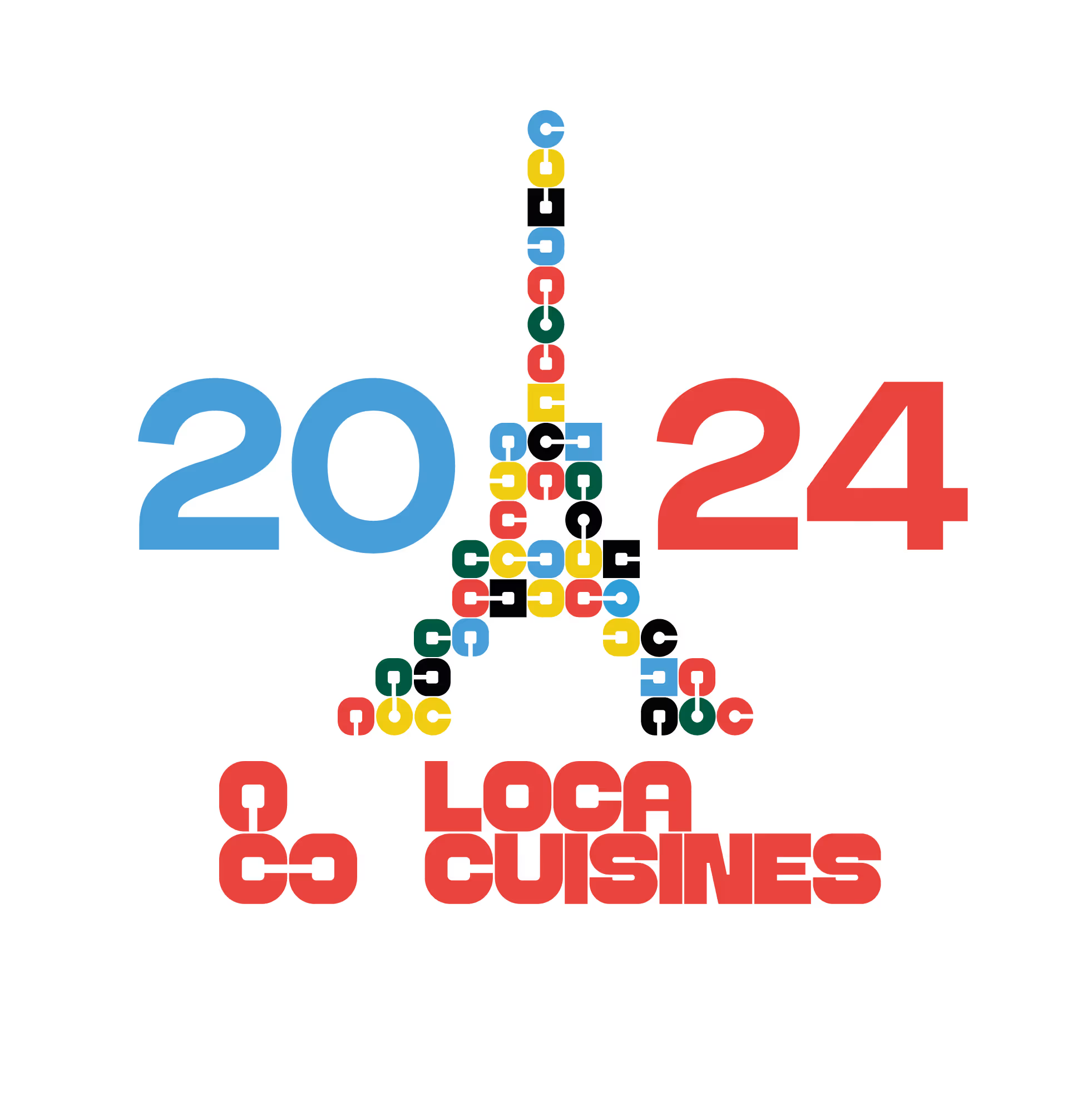
In 2025, LocaCuisines is entering a new phase of its development. To embody its ambitions for the years 2025–2030, the company is unveiling a new signature logo. This logo does not replace the brand’s main logo, but rather complements it. It underscores a strong trajectory: that of a professional, innovative, and committed player, ready to take on the challenges of tomorrow in the modular kitchen sector.

A logo that embodies the essence of LocaCuisines
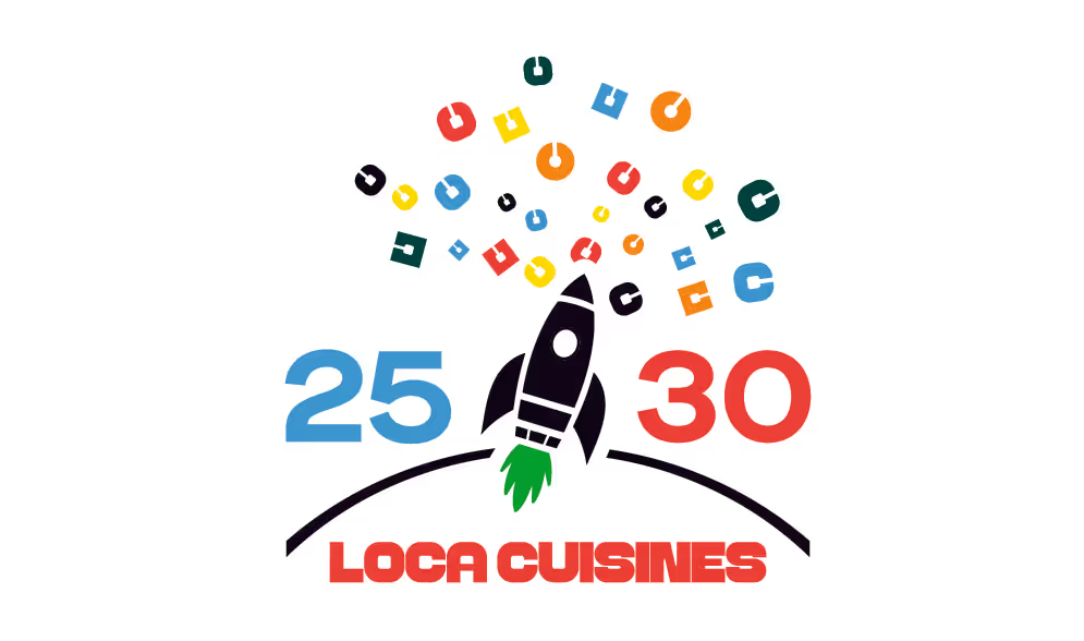
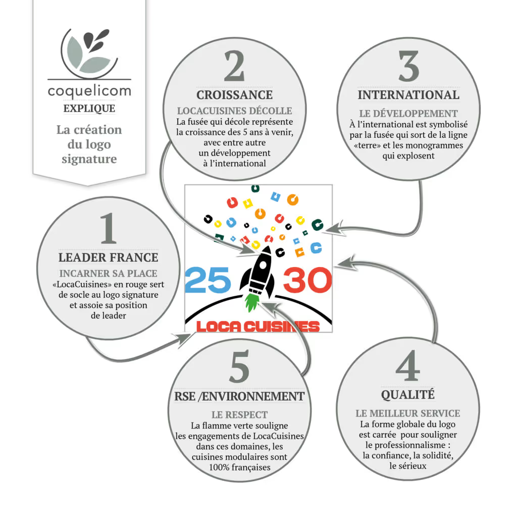
Designed as a visual signature, this new logo reflects what LocaCuisines is today and what it aspires to become tomorrow. LOCACUISINES is displayed on a single line for greater readability. This line represents our foundation: the rental of professional kitchens and equipment, which has always been at the heart of our business.
It is also this line that becomes our springboard, our horizon, our launching pad.
A Boost for Growth… and the Planet
The centerpiece of the logo? A sleek black rocket, both elegant and dynamic. Inspired by a fish, it reflects not only our roots in the world of cooking but also our desire to reach high, go far, and move fast. Its black color symbolizes our premium positioning, as well as the reliability and quality of our services.
But this rocket doesn’t lose sight of what matters most: it runs on biofuel, and its green flame embodies our CSR commitment—respect for the environment, French manufacturing, and a reduced carbon footprint… A clean launch, in line with our values.
Powerful symbols to convey our ambitions
Surrounding the rocket, our colorful monograms burst into space. They evoke:
- the diversity of our business lines
- our expertise
- Our Goals
- and the stars we strive for every day
The "25–30" reference alludes to the pivotal years ahead: 2025–2030. It is framed by the iconic colors of our two brands: LocaCuisines’ red and MyLocacuisines’ blue.
A Creative and Committed Collaboration with Enora (Coquelicom)
This signature logo is the result of a collaborative effort between our communications teams and Enora, founder of the Coquelicom studio.
“Locacuisines’ brief was clear: to visually convey their growth ambitions, their commitment to quality, their focus on CSR, their leadership position, and their team spirit—all with a touch of fun.” – Enora, graphic designer
The logo thus incorporates the hallmarks of professionalism (square shape, clean lines), while adding emotion, movement, and a vision of the future.
“Working for Locacuisines means aligning graphic design with strong values that I share: a commitment to excellence, respect for people and the environment, and pride in a job well done.” – Enora
LOCACUISINES: Setting Our Sights on 2025–2030
This new visual identity is much more than just a change in style. It reflects LocaCuisines’ vision for the years ahead:
- controlled growth
- a consistent commitment to quality
- a selection of high-performance professional equipment
- a responsible company committed to CSR
- a collaborative, people-centered, and ambitious project
2025–2030: Our goals are clear. The course has been set. And we’re ready to stay the course.


.png)

.webp)
.avif)


.avif)
%20(1).avif)
.avif)